”Freestyle” Documentation
Theme version 1.0 | Change log
This theme is not supposed to be a 1-click theme that takes care of everything for you. Rather, the ”Freestyle” theme for Contao has been created to give you a good place to start your projects. It doesn't attempt to be a full-blown theme with lots of bells and whistles, but rather keeps things very clean and basic, and easy to extend to your needs. That way you don't have to ”un-style” the theme before using it for your project. On the other hand it could be that not everything you need is 100% perfectly styled out of the box.
”Freestyle” doesn't depend on any external extensions but makes use of Contao's own built-in functionality, in order to keep it as compatible as possible. Layout and styling is achieved by adding CSS classes to articles and content items, and sometimes by choosing the appropriate module- or content-item templates. To that effect very few templates had to be adjusted.
Installation
OPTION A – Install as Theme
1. Unzip the freestyle35_#.zip folder locally.
2. In Contao navigate to Themes -> import theme, select freestyle35_#.cto as source file and follow the installation steps. After installing the theme you are ready to roll!
Option B – Install as Website template (with demo content)
For new projects and to make yourself familiar with some of the possibilities of this theme I recommend installing the optional demo data.
IMPORTANT: please follow the following steps in exactly this order:
1. Unzip the freestyle35_#.zip folder locally.
2. In Contao navigate to Themes -> import theme, select freestyle35_#.cto as source file and follow the installation steps.
3. Upload the freestyle-demo35_#.sql file into the /Templates folder of your Contao installation.
4. Navigate to yourdomain.com/contao/install.php and enter your installation password.
5. Go down to ”Import a template” and choose freestyle-demo35_#.sql as template file.
6. Click ”Import template” – WARNING! All existing data in the database will be replaced with the demo entries! Don't take this step if you don't want to lose existing data!
7. Log in with the standard Contao demo admin user:
user: k.jones
password: kevinjones
8. Make sure to change the demo admin user and the demo admin user password immediately after login if you are on a public facing server!
How to change default layout values
Contao is equipped with something called ”Global variables”. Global variables are defined in the Style Sheet settings and applied when the page is rendered. They work like a very simple form of LESS or SCSS. ”Freestyle” makes extensive use of Global variables which makes changing the theme very convenient and quick.
If you want to change colors, fonts etc. the first place to go to is the Basic_settings style sheet and then the Settings_Desktop, Settings_Tablet and Settings_small settings (the wrench and screw driver icon). You are free to extend the Global variables to your needs. If you change the break-points in either of those style sheet settings, make sure to adjust the Pocketdrid.css, Typo.css and the Layout.css files accordingly.
Global variables
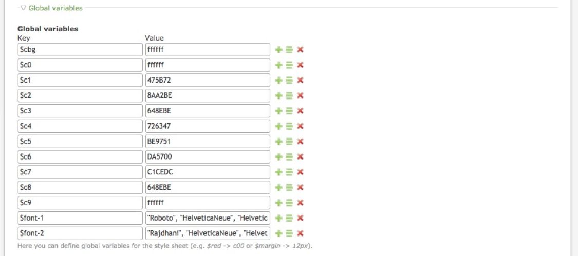
In the settings of each internal style sheet you will find a number of pre-defined Globale Variables that are used in the CSS. These variables are applied only to the style sheet in which they are declared! Of course you are free to add more if you want. If you want to use variables that are used across all style sheets, you have to declare them in the theme settings.
Page layout: CSS settings
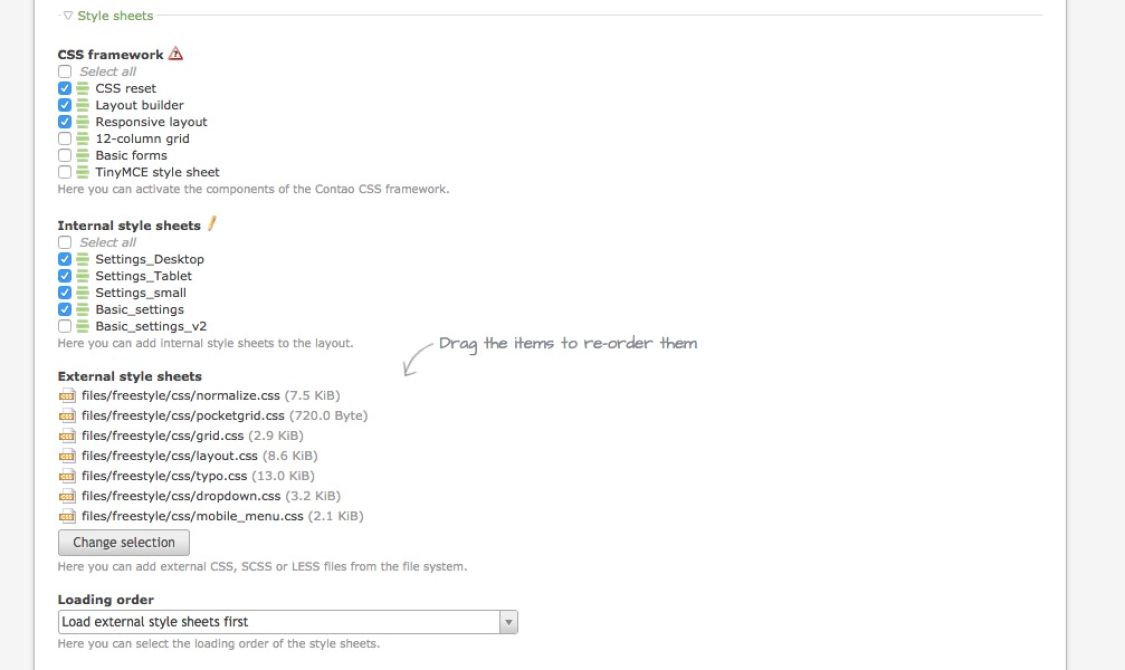
The included internal and external CSS style sheets can be modified to your needs. For the theme to work it is important that the external style sheets are loaded first, then the internal! Keep the order of the style sheets.
Here is a short explanation of what they do:
- Basic_settings: contains settings that apply to all screen sizes. They overwrite CSS properties that are declared in external style sheets
- Settings_small: contains the values for small screen sizes
- Settings_Tablet: contains the values for tablet screen sizes
- Settings_Desktop: contains the values for desktop screen sizes
- grid.css: contains a number of pre-defined grid widths. You are totally free to modify the styles and write your own ones. You can also add more breakpoints if you need. You can make up your own system of classes that make sense to you and the project you are working on.
- layout.css: contains the most important declarations for the theme to function properly. Be careful if you change things here.
- normalize.css: "normalize" browsers
- pocketgrid.css: contains the Pocketgrid framework. Don't change things here.
- typo.css: contains typography related styling.
- dropdown.css: contains the styles that are needed to create the dropdown menu. You can disable this style sheet if you are not using the built-in navigation system.
- mobile_menu.css: contains the styles that are needed to create the mobile menu. You can disable this style sheet if you are not using the built-in mobile navigation system.
Page layout: additional Javascript
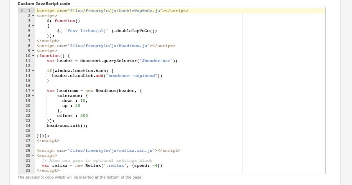
In the predefined page layouts you will find a few lines of <script> at the bottom. You are not forced to keep them, if you don't require their function.
Here is what they do:
- DoubleTapToGo.js: enables the dropdown menu to function properly on touch devices where no hover is available. If your navigation is called something else then #nav, then change the value here accordingly.
- Headroom.js: is responsible for the sliding effect of the header-bar. You can adjust the values to achieve a different behaviour. If the area that you want to hide on scroll is called something else then #header-bar, then you have to change the value here accordingly.
- Rellax.js: is responsible for the parallax-effect in the header. Only works for elements that have a .rellax class. This can be changed to something else if you want
Your page layout
You have two basic options to choose from:
- a full-width layout, stretching across all of the viewport. This option allows you to achieve designs that are currently very popular.
- a boxed layout with a defined content area that doesn't stretch across the viewport and a viewport background.
Full-width layout
In your page layout add ”full-width" as a body class and in the theme CSS settings you need to define the values for the maximum content width for desktop and tablet sizes.
If you want to add a left and/or right side column, choose the respective layout option in the page layout setting. Don't add any value in the ”width” field, you will do that in the CSS settings.
Boxed layout
In your page layout add ”boxed" as a body class. If you want to add a subtle shadow to your page, add ”boxed shadow” as a body class. In the theme CSS settings you need to define the values for the maximum content width for desktop and tablet sizes.
If you want to add a left and/or right side column, choose the respective layout option in the page layout setting. Don't add any value in the ”width” field, you will do that in the CSS settings.
Using articles for layout
Instead of using the Contao layout builder to add side columns you might want to try using articles side-by-side by adding respective grid classes.
Using Pocketgrid
The grid of this starter kit is based on Pocketgrid and can be configured any way you like to create a fluid, fully responsive layout. You can even use any classes you like. The classes provided in this theme are just some examples that you can adjust or completely exchange for new ones. Simply add the respective block classes to the content elements that you want to give a certain width. As soon as 100% are reached, the row will break into the next. You don't have to worry about small screen, because on small screens the blocks will default to 100%, i.e. they will have full width automatically (unless you tell them otherwise). You can set any break points that you need to achieve the desired behaviour for various screen sizes. For the grid layout of this sample website, we use only very few classes to define the respective widths of the blocks. As mentioned, you can call those blocks anything you like. You can call them "b1", "b2", "b3"... as in this example or "grid1", "grid2", "grid3" or "tomato", "potato", "salad" - or mix it all together. It doesn't matter, as long as it works for you.
Strictly speaking, Pocketgrid is not even a grid. It is a minimalist framework that allows you to create responsive, elastic, mobile-first layouts. It is truly semantic in the sense that it keeps your HTML clean of any design-related classes like "large-50 medium-50 small-100 xsmall-100". In Pocketgrid all the grid-layout is happening in the CSS, not in the HTML. You just give each block that you want to bring into a column-layout a class and define in the CSS the widths it should have for the various breakpoints (which you can freely define). That way you are completely free to fine-tune your layout according to what the content requires in the various screen sizes.
You can do that to any element that has a "block" class, p.e. articles, modules and content elements. No rows needed. That makes layout extremely flexible, since Contao is so nice and adds "block" to almost anything already!
The grid classes are defined in the grid.css file.
A comprehensive documentation on pocketgrid can be found here.
Article styles and overlays
By default ”Freestyle” comes with a set of predefined CSS styles that you can apply to articles. The styles are called style-1, style-2, style-3... and can be adjusted in the Basic_settings style sheet settings. You can use these styles to add color backgrounds, background-images etc. to articles. While you can use them in any layout, it makes most sense when you use a full-width layout.
In combination with an ”overlay” class you can achieve nice background effects, p.e. you could add a fixed background image and a gradient or color background behind an article. This can be especially useful if the background image is too detailed or too bright or dark.
Header image and slider
Edge-to-edge header images that scale with the page are very popular. With Freestyle you can achieve this with static images and the built-in content slider that Contao offers.
Step 1: create a new article in the Header layout section. Add ”header-image” as CSS class to the article.
Step 2: Add a content element of the type ”Text” (or ”Image” if you don't want to add text). Change the custom element type to ce_text_headerimage or ce_text_headerimage_parallax. This is important! You are free to use the rich text editor to style the overlay Text.
If you want to use a slider instead of a static image you can do so (even multiple sliders next to each other like here). Repeat step 2 with every image you want to add and wrap the series of images between the opening and closing Slider elements.
Image effects
Pop out

Add the class ”pop-out” to add a popping out effect to linked images. Works with any image that opens in a lightbox or is otherwise linked. Works with galleries as well.
Push in
Add the class ”push-in” to add a push-in effect to linked images. Works with any image that opens in a lightbox or is otherwise linked. Works with galleries as well.
Round
Add the class ”round” to give an image a round container
Helper classes
.hide-controls
Add class "hide-controls" to the Slider start element to hide the slider controls.
.no-margin
Use ”no-margin” class to remove padding and margin of an article. This can be useful to create tiles etc. By default not applied to text.
.new-row
Add ”new-row” class to force a new row.
.center
Add ”center” class to center an element horizontally.
.right
Add ”right” class to float an element right. If you apply .right to block elements you need to define a width as well to make it work (because blocks have by default a width of 100% and therefore no space to float.)
.offsetxx
Add ”offset10”... "offset90" class to offset an element (offset10 offsets the element by 10%, offset20 by 20%...).
.radius3, .radius5, .radius10
Add ”radius3”, "radius5" or "radius10" class to give an element a border radius of 3px, 5px or 10px. Class will be inherited by elements lower in hierarchy, p.e. if you add "radius10" to an article, all elements in this article will have a radius of 10px.
.light
Add ”light” to an element to change text color to white and add a subtle drop shadow. Meant to improve contrast against dark or noisy background images.
Overlay effects
To add an overlay effect simply add "overlay-1", "overlay-2..." to the element that you want to give the overlay effect to. The theme comes with a few pre-defined overlays (overlay-1 to overlay-5) that you can customise in the Basic_settings style sheets, but you can create as many overlay effects as you want. The only requirement is that the name of your style starts with "overlay" and you define the overlay style as "overlay-xyz:before".
You can even use gradients (see example)! The Contao style editor gives you basic tools to build gradients, but if you want to built complex gradients you might want to use tools like http://angrytools.com/gradient and drop the code into the custom code field.
Buttons
Box styles
Add a ”box” class to the content element to define a box. You can adjust the styling to fit your needs.
Infobox
Add a ”infobox” class to the content element to create a box with info-icon.
Confirmation
Add the classes ”infobox success” to create a confirmation box.
Warning
Add the classes ”infobox warning” to create a warning box.
Predefined spacer classes:
Sometimes you need extra space at the top or bottom of an element. In that case you can add one of the following classes.
- space-top10
- space-top20
- space-top30
- space-top40
- space-top50
- space-bottom10
- space-bottom20
- space-bottom30
- space-bottom40
- space-bottom50
Divider
.divider-top
Creates an inset shadow divider at the top of an element. Nemo enim ipsam voluptatem quia voluptas sit aspernatur aut odit aut fugit, sed quia consequuntur magni dolores eos qui ratione voluptatem sequi nesciunt. Neque porro quisquam est, qui dolorem ipsum quia dolor sit amet, consectetur, adipisci velit, sed quia non numquam eius modi tempora incidunt ut labore et dolore magnam aliquam quaerat voluptatem.
.divider-top-bottom
Creates an inset shadow divider at the top and the bottom of an element. Nemo enim ipsam voluptatem quia voluptas sit aspernatur aut odit aut fugit, sed quia consequuntur magni dolores eos qui ratione voluptatem sequi nesciunt. Neque porro quisquam est, qui dolorem ipsum quia dolor sit amet, consectetur, adipisci velit, sed quia non numquam eius modi tempora incidunt ut labore et dolore magnam aliquam quaerat voluptatem.
.divider-bottom
Creates an inset shadow divider at the bottom of an element. Nemo enim ipsam voluptatem quia voluptas sit aspernatur aut odit aut fugit, sed quia consequuntur magni dolores eos qui ratione voluptatem sequi nesciunt. Neque porro quisquam est, qui dolorem ipsum quia dolor sit amet, consectetur, adipisci velit, sed quia non numquam eius modi tempora incidunt ut labore et dolore magnam aliquam quaerat voluptatem.
.feature-item
Add a ”feature-item” plus an ”icon-” class to a text element to create feature items or highlight boxes as such:
Nemo enim ipsam voluptatem
Nemo enim ipsam voluptatem quia voluptas sit aspernatur aut odit aut fugit, sed quia consequuntur magni dolores eos qui ratione voluptatem sequi nesciunt. Neque porro quisquam est, qui dolorem ipsum quia dolor sit amet, consectetur.
Sed ut perspiciatis
Nemo enim ipsam voluptatem quia voluptas sit aspernatur aut odit aut fugit, sed quia consequuntur magni dolores eos qui ratione voluptatem sequi nesciunt. Neque porro quisquam est, qui dolorem ipsum quia dolor sit amet, consectetur.
Neque porro quisquam
Nemo enim ipsam voluptatem quia voluptas sit aspernatur aut odit aut fugit, sed quia consequuntur magni dolores eos qui ratione voluptatem sequi nesciunt. Neque porro quisquam est, qui dolorem ipsum quia dolor sit amet, consectetur.
Sed ut perspiciatis
Nemo enim ipsam voluptatem quia voluptas sit aspernatur aut odit aut fugit, sed quia consequuntur magni dolores eos qui ratione voluptatem sequi nesciunt. Neque porro quisquam est, qui dolorem ipsum quia dolor sit amet, consectetur.
Icons
To use the icon fonts in your design you have to add the respective icon class in the CSS field of content elements or pages. If you p.e. add the class "icon-home" in the CSS field of the home page, a house icon will be displayed in front of the navigation link.
You can find a demo HTML file in the /fonts folder that will help you find the corresponding codes to each icon (but you will only need the code in case you want to use icons in CSS declarations).
Known issues
The boxed layout is not displayed correctly in iOS <=5 and older browsers
The CSS method calc() is not supported in older browsers (p.e. iOS 5 Safari, Firefox <4, Chrome <20, IE <8).This problem can easily be solved by replacing the layout widths (#left, #main, #right...) with %-values instead of using the calc() method used in the Settings_Desktop style sheet. This will not affect the functionality of your layout at all. Alternatively you can enable the layout_fix.css for your page layout and edit the values according to your needs. Newer browsers will still use the calc() instructions. In case your version of Freestyle came without the layout_fix you can download it here:
The header bar doesn't hide when scrolling in older iOS browsers
This is just a cosmetic issue, the menu is still fully functional. Not aware of a solution for this issue at this point.